How to Choose the Right Color Palette For Your Home

Choosing a color palette for your home can feel like a big decision. You may love several colors individually, but creating a home that feels polished and connected requires more than simply picking a few favorite shades.
The best interior design color palette should complement your furniture, flooring, fabrics, lighting, and architectural finishes while also reflecting your personal style.
Whether you are furnishing a new home, updating one room, or refreshing several spaces, choosing your colors early can make the rest of the design process much easier.
Start With How You Want Your Home to Feel
Before looking at paint colors, think about the feeling you want your home to have.
Do you want it to feel:
- Light and airy?
- Warm and inviting?
- Calm and relaxing?
- Sophisticated and elegant?
- Fresh and colorful?
- Dramatic and cozy?
The mood you want to create can help guide your color choices.
Soft blues, warm whites, muted greens, and light neutrals can create a relaxed atmosphere. Deeper blues, warm browns, rich greens, and stronger accent colors can add depth and personality.
There is no single perfect color palette for every home. The right palette is the one that works with your surroundings and feels natural to you.
Begin With an Inspiration Piece
One of the easiest ways to choose a color palette for your home is to start with something you already love.
That could be a:
- Rug
- Favorite fabric
- Piece of artwork
- Sofa or chair
- Bedding
- Countertop
- Fireplace stone
- Wallpaper
- Window treatment
Many of these items already contain several coordinating colors.
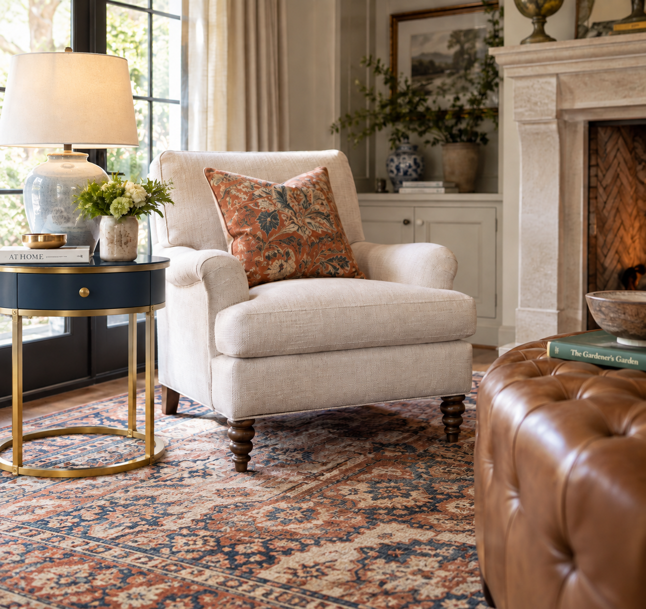
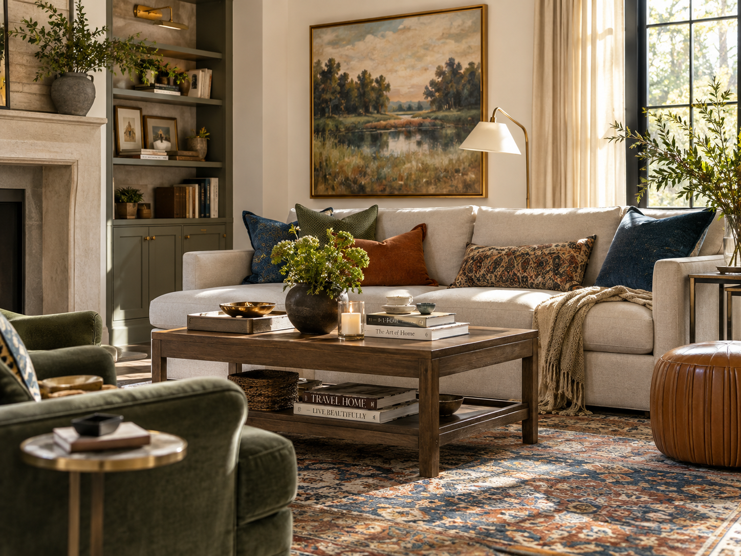
For example, a rug with shades of blue, cream, camel, and muted green could inspire an entire room. You might use a warm neutral on the walls, blue upholstery, natural wood tones, and soft green accents.
Starting with an inspiration piece gives you a built-in roadmap for the rest of the room.
Pay Attention to Undertones
Undertones are one of the most important parts of choosing interior colors.
Two shades may both be called beige, gray, white, or blue but look completely different once they are placed next to each other.
Neutrals can have warm undertones such as yellow, gold, pink, or red. Others may lean cooler with blue, green, or violet undertones.
White paint works the same way. One white may feel warm and creamy, while another may look crisp and cool.
This is why it is important to compare paint colors with your actual flooring, furniture, rugs, countertops, and fabrics before making a final decision.
A beautiful color by itself may not be the right color for your room.
Choose Your Main Color
Every room needs a foundation.
Your main color is often the shade used across larger areas such as the walls, upholstery, or a large rug.
Popular foundation colors include:
- Warm white
- Cream
- Beige
- Greige
- Soft gray
- Light blue
- Muted green
Starting with a neutral foundation can give you flexibility while still allowing the room to have plenty of personality.
Neutral does not have to mean boring. Texture, fabric, wood tones, artwork, lighting, and accessories can bring a neutral room to life.
Add One or Two Secondary Colors
Once you have your foundation color, select one or two secondary colors to give the room dimension.
These colors might appear in:
- Accent chairs
- Drapery
- Rugs
- Pillows
- Artwork
- Upholstered furniture
- Accessories
A few combinations that work beautifully include:
Warm and Relaxed:
Cream + soft blue + natural tan
Classic and Sophisticated:
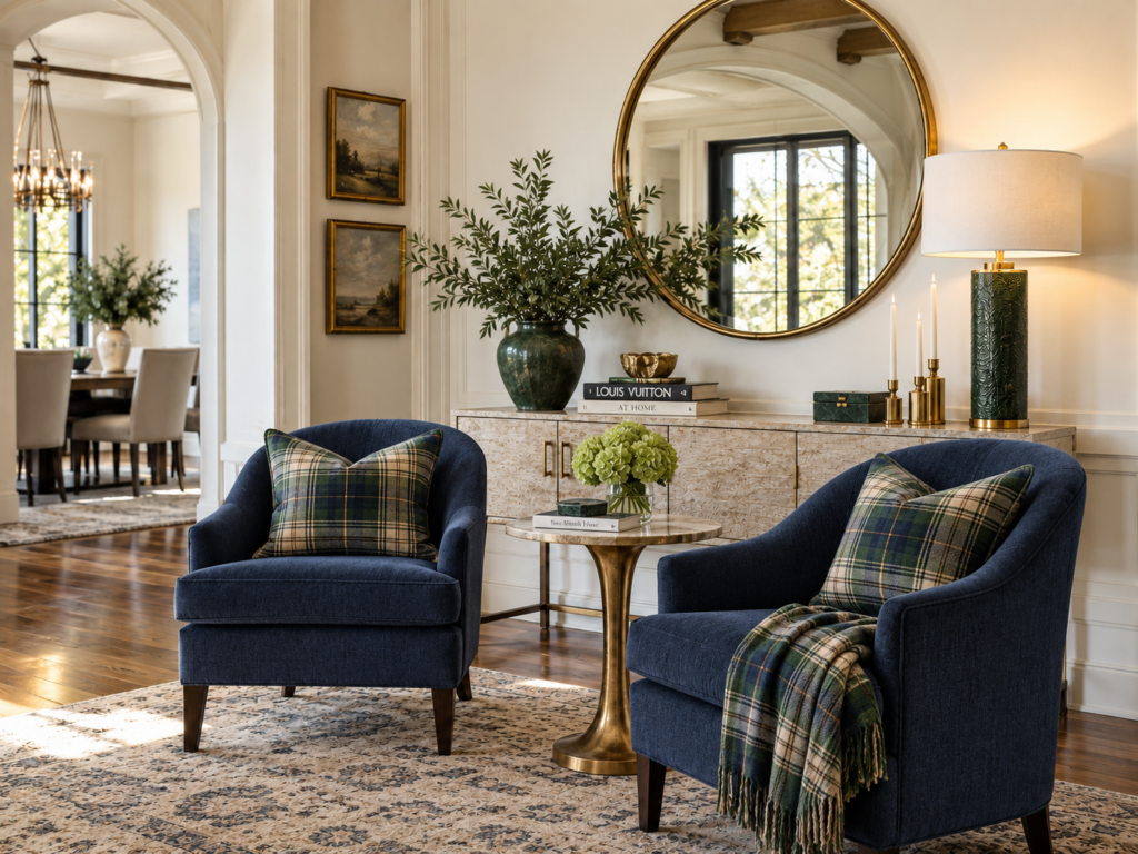
Warm white + navy + camel
Fresh and Natural:
Soft beige + muted green + warm wood
Light and Airy:
Warm white + pale blue + sandy beige
Rich and Elegant:
Greige + deep blue + burgundy
Your colors do not need to match exactly. In fact, using slightly different shades within the same color family often creates a more collected and professionally designed look.
Bring In an Accent Color
Accent colors are where you can add a little more personality.
They work especially well in smaller pieces such as:
- Pillows
- Throws
- Artwork
- Decorative accessories
- Lamps
- Florals
- Small furniture pieces
If your room is mostly neutral, an accent color can keep it from feeling flat.
You can also change accent colors much more easily than a sofa, rug, or large piece of furniture, making them a great place to experiment.
Think Beyond the Paint Color
When people think about choosing a home color palette, they often start with the walls.
But paint is only one part of the overall design.
Your furniture, rug, fabrics, flooring, artwork, wood finishes, lighting, metals, and accessories all contribute to the way the room feels.
For example, you could have a beautiful beige wall color, but if your upholstery has cool gray undertones and your rug has strong golden undertones, the room may still feel disconnected.
A successful interior design color palette considers everything in the room together.
Let Your Rug Help Guide the Room
A rug is often one of the best places to begin your color story.
Patterned rugs can include several different colors, making them especially useful when building a room palette.
Look closely at all of the shades within the rug. One color might inspire your sofa, another could appear in pillows, and a smaller accent shade might be repeated in artwork or accessories.
Repeating those colors around the room creates harmony without making everything look overly matched.
Pay Attention to Lighting
Lighting can completely change the way a color looks.
Natural light, artificial light, window direction, and time of day can all influence how you see a paint color or fabric.
A color that looks perfect in a showroom may look very different in your home.
Before committing to a paint color, view a larger sample in several areas of the room. Check it in the morning, afternoon, and evening.
Also place the sample near your flooring, upholstery, countertops, and other important finishes.
This simple step can help you avoid expensive color mistakes.
Create Flow From One Room to the Next
A well-designed home should feel connected, especially when rooms are open to one another.
That does not mean every room needs to be the same color.
Instead, repeat certain colors throughout your home in different ways.
For example, a blue sofa in the living room might connect to:
- Blue dining chairs
- Artwork in the hallway
- A blue pattern in a nearby rug
- Pillows in a sitting room
- Decorative accessories in the kitchen
Repeating colors helps each space feel intentional while still allowing every room to have its own personality.
This approach is especially important in open-concept homes.
Work With Your Home’s Fixed Finishes
Before choosing new colors, take a close look at the features that are already part of the home.
These may include:
- Flooring
- Countertops
- Tile
- Cabinetry
- Fireplace stone
- Brick
- Woodwork
- Built-ins
These finishes already contain colors and undertones.
Your new palette should work with them rather than compete with them.
If you have warm hardwood floors, for example, an extremely cool gray palette may not create the most natural transition. A warmer neutral, soft beige, or balanced greige may coordinate much better.
Don’t Be Afraid to Use Color
Some homeowners choose neutral everything because they are afraid they will eventually tire of color.
But color does not have to be bright or overwhelming.
Soft blue, muted green, dusty rose, navy, warm terracotta, and deeper earthy tones can all add character while still feeling timeless.
The key is knowing where to use stronger color.
If you prefer a classic look, keep your largest investment pieces more versatile and introduce stronger colors through items that are easier to change.
A Simple Color Palette Formula
If you are wondering how to choose a color palette for your home, try this simple approach:
Step 1: Choose an inspiration piece.
Step 2: Select your main neutral or foundation color.
Step 3: Add one or two coordinating colors.
Step 4: Introduce an accent color.
Step 5: Repeat those colors throughout the room in different amounts.
Step 6: Layer in texture through rugs, fabrics, wood, metals, and accessories.
This gives you enough variety to keep the room interesting while still creating a cohesive look.
Always Sample Before You Commit
Never choose an important paint, fabric, or finish based only on a computer screen or tiny swatch.
Bring samples into your home whenever possible.
Place your paint sample beside the flooring, furniture, fabrics, and rugs. Move it around the room and look at it under different lighting conditions.
A little extra planning before you order furniture or begin painting can save you from making costly changes later.
Create a Color Palette That Feels Like Home
A beautiful color palette should do more than follow the latest trend.
It should make your home feel comfortable, connected, and personal.
When I work with clients, I look at the complete space. Furniture, fabrics, rugs, finishes, lighting, paint colors, and surrounding rooms all influence the final design.
With more than 26 years of design experience, I have learned that making thoughtful color decisions early in the process makes many of the choices that follow easier.
As an Interior Designer at Furnitureland South, I work with clients on furniture selections, space planning, fabrics, rugs, lighting, accessories, and complete room designs. Whether you are furnishing a new home or refreshing a space you already love, having professional design guidance can help bring all of the pieces together.
Need Help Choosing the Right Colors for Your Home?
If you are unsure where to begin or want help creating a coordinated color palette for your home, I would love to work with you.
Together, we can create a home that feels beautifully coordinated, comfortable, and uniquely yours.
Dawn Williams
Interior Designer | Furnitureland South